UI Mockups and Wire Framing
I am not, strictly speaking, a UX designer. Every developer creating software with a User Interface should be familiar with some basic UI design concepts, and definitely needs to be aware of UI limitations on the application’s targeted device platforms, so I make it a point to think through my software designs to see what makes sense and what does not.
I often find that once I’ve sketched out some basic pages and screens for applications I’m designing, the imagined results often include hidden flaws that need to be corrected before coding the user interface can begin.
There are many professional tools and applications for wire framing, and some are better than others. I find one of the quickest and most efficient means of creating the wire framing essentials is to use a sketchbook and, when needed, some drawing aids such as straight edges and templates.
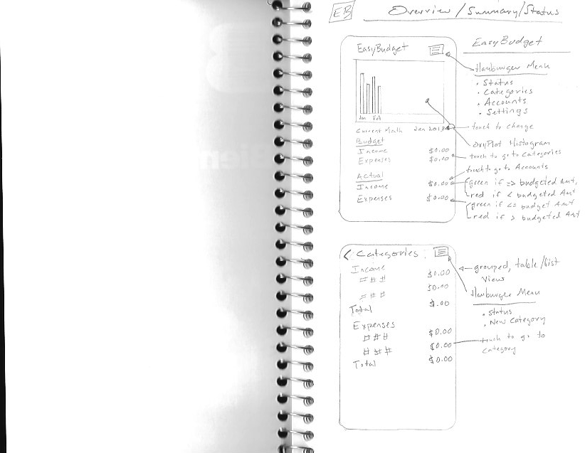
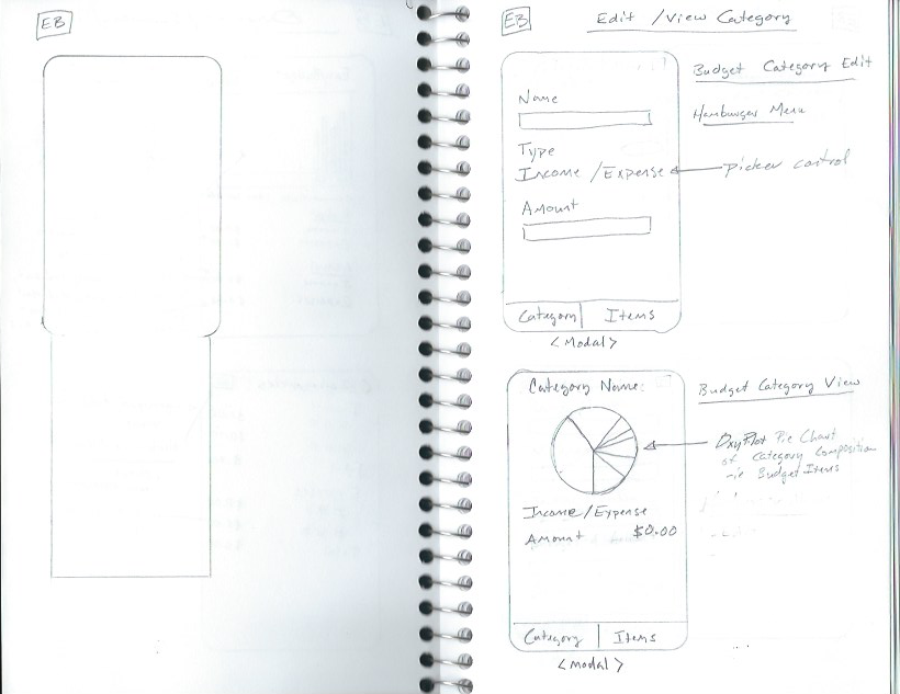
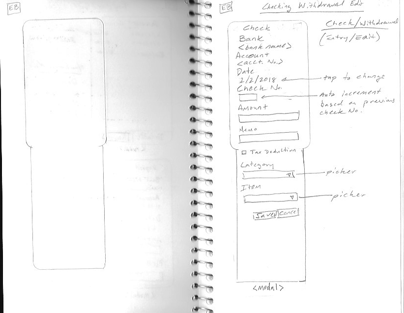
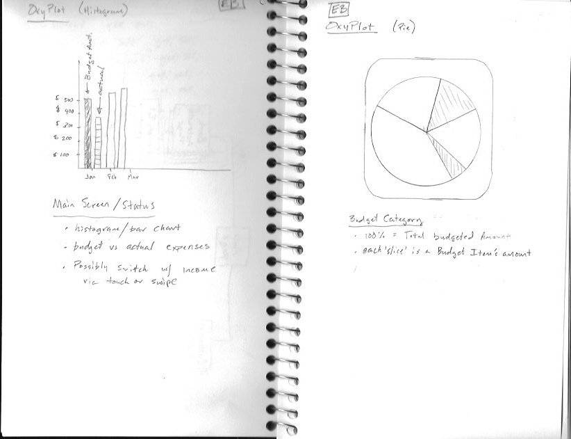
To paraphrase a famous quote, no battle plan ever survives first contact with the enemy. The same applies to UI design. The screens for this application were sketched out and notated, but actual implementation worked out a bit differently once coding began.
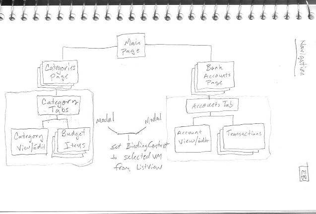
Navigation menus and toolbars turned out to be the biggest issue with creating the application pages going by the initial screen navigation ideas and wire frames.
The issue is with the tabs when viewing a Budget Category or Bank Account. Using a Navigation Bar on the TabbedPage makes for clunky experience in Android because tabs are on top of the screen on Android devices due to the software buttons on most Android devices.
To resolve this, the TabbedPage instances are made modal instead of trying to add them to the navigation stack.
